What and how much our Federal, State and Local governments tax is summarized here. Now, who pays what fraction of the total?
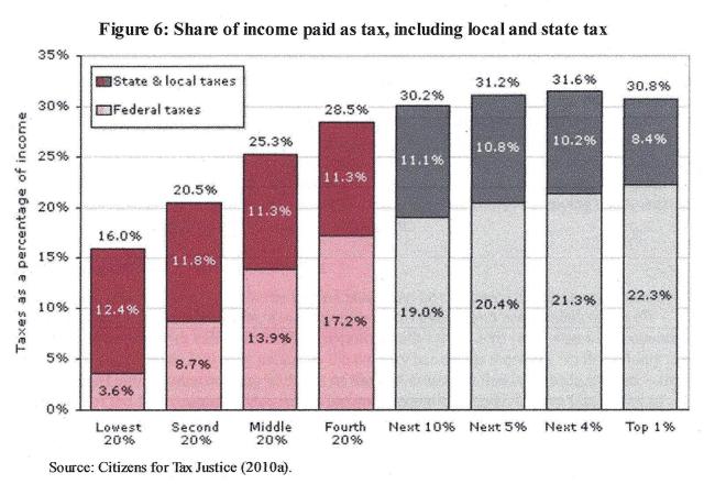
We’ll start with people, then corporations. This chart shows what % of total taxes is paid by each income group. The lowest 20% who average about $12,400 per year, paid 16% of their income in taxes in 2009. Less than 4%, a quarter of their total, is income tax. The rest is sales and other kinds of tax.
The next 20% who average about $25,000/year paid 21% of their income in taxes, about 40% of their overall tax being income tax. The middle 20% who average about $33,400/year paid 25% in total. The next 20% who average about $66,000/year paid 29%.
The top 20% is broken down in more detail. The lower half who average about $100,000/year pay 30% and the next 5% who average $141,000/year pay 31%. The next 4% who average $245,000/year pay 32%. The top 1% who average $1.3 million/year pay 31% of their income to taxes. This means that while a higher percentage of total tax is paid by each group in the bottom 80%, the rate of increase then slows and the top 1% pays less than the 9% below and little more than the 10% below them.
What may be more surprising is the share of total tax paid by each group relative to its share of total income. The top 20% gets 59% of all income and pays 64% of all taxes. The bottom 20% gets 3.5% of all income and pays 2% of all taxes. The top 20% pays a greater share of taxes than they receive of income, but the ratio is not very different across the entire range of incomes.
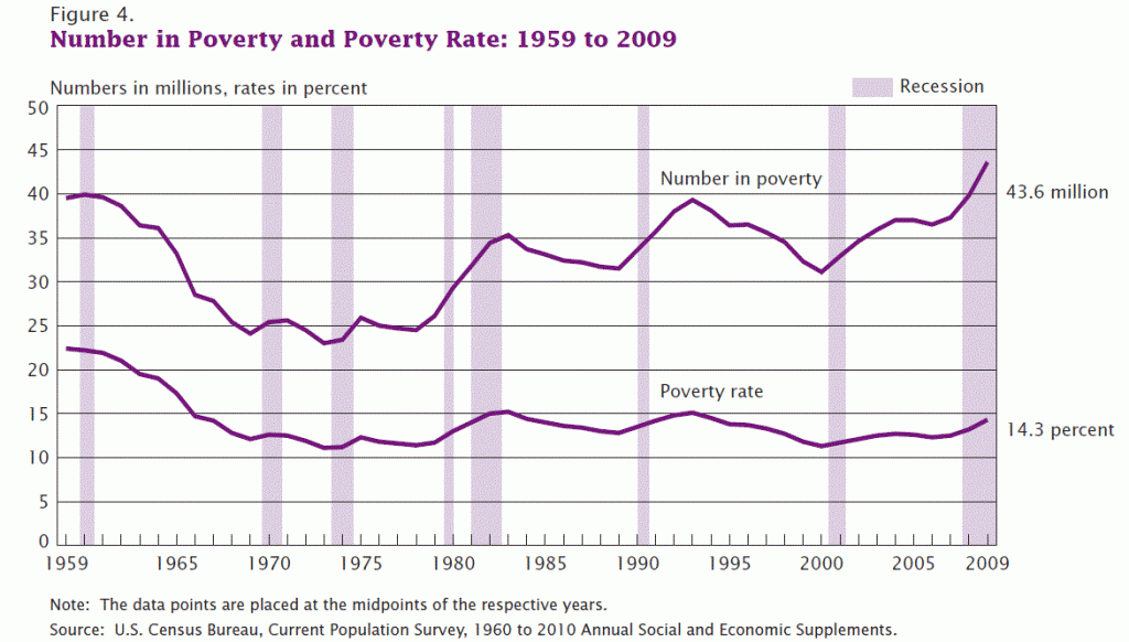
What is the result of total taxes on each income group? The Dept of Health and Human Services determines eligibility for federal programs using thresholds below which families are considered to be “lacking the resources to meet the basic needs for healthy living; having insufficient income to provide the food, shelter and clothing needed to preserve health”. The Census Bureau reported 16% of Americans below the poverty threshold at the end of 2012.
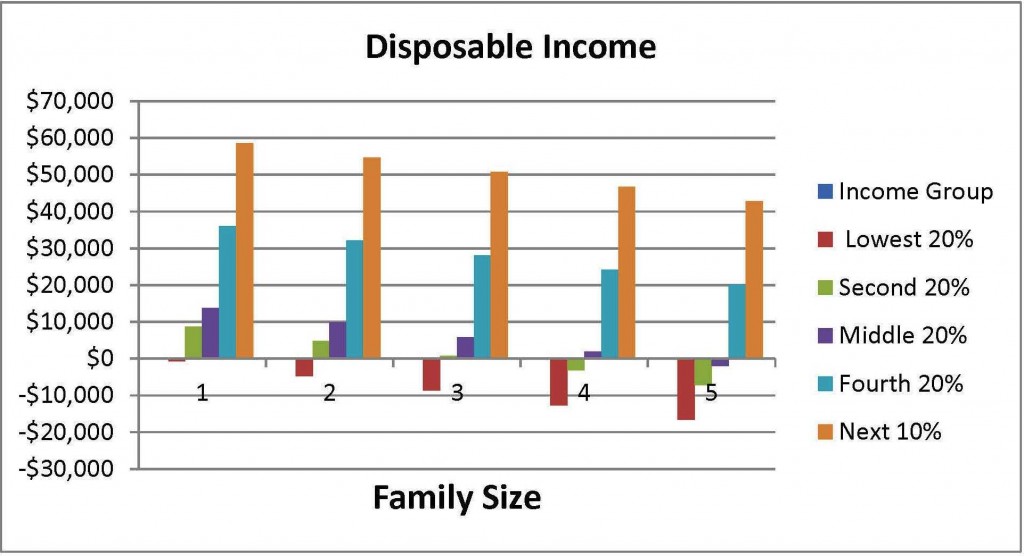
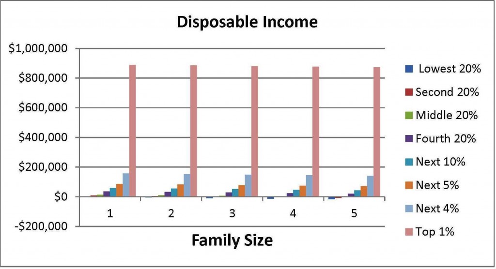
The following table shows how average post-tax income of each income group compares to what I call “disposable income”, the difference between the poverty threshold and the average post-tax income of each group. A single person in the lowest 20% group, for example, with a pretax income of $12,400 who pays that group’s average of 16% in total taxes has a post-tax income of $10,416, which is $754 less than the $11,170 poverty threshold for a single person. If they had a spouse and their joint post-tax income was the same $12,400, their post-tax income would be $4,714 less than the poverty threshold. A family of four in the second 20% would be $3,175 below their poverty threshold. Even in the middle 20% a family of five would be living in poverty.
The first of the following charts highlights the result of total taxes on the lower income 90% of Americans, the second gives a sense of the very high disposable income available to the top 1%. In a future post I will examine what distribution of wealth Americans believe is desirable.
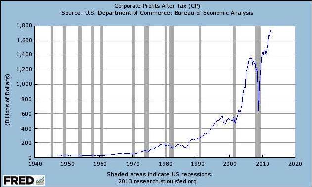
Turning now to corporations, we know they, too, pay varying combinations of income, social security, property and other taxes. I suspect their share of total taxes and total income has a similar pattern as for individuals but I have not found the necessary data to know. Corporations have recently grown enormously more profitable, especially large multinationals.
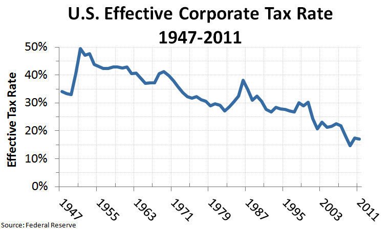
The effective corporate tax rate has fallen pretty steadily from 50% at the end of WW2 to 17% now. Since there are ways not available to smaller businesses that large multinationals can use to avoid tax, I expect the effective tax rate would be much lower for large corporations.
This is not an academic exercise so I will not try to quantify total tax rates paid by corporations categorized by their income size. It will be more illuminating to explore in the next post what we do not tax – exemptions, deductions and so forth – and how what we do not tax impacts different income groups.



Tom asked: “Can you show the total amount of revenue generated by taxing each quintile? Showing the percentage we tax each quintile doesn’t show us how much we generate from taxing each quintile. How much do we need to increase taxes on, for example the top 1 or 2 percent, to recover what we’ll lose by dropping taxes on say the fourth quintile by 1%.”
I replied: ” The way I think this series will develop is, next, “what we don’t tax”, i.e., exemptions, deductions and etc, (probably separate posts about individuals and corporations), then how much revenue we need to raise and how we might go about doing that. I want to make sure I understand how the existing system works and its results before I try to figure out one or more ways it could work “better” and the necessary changes.”
I am looking forward to your promised analysis of the distribution fo wealth. There has been much coverage lately celebrating the “US household wealth regains pre-recession peak” milestone, e.g.,
http://finance.yahoo.com/news/us-household-wealth-regains-pre-recession-peak-172154266–finance.html
There has been less coverage of the distribution of the recovery, but the above linked article does say “The recovered wealth — most of it from higher stock prices — has been flowing mainly to richer Americans. By contrast, middle class wealth is mostly in the form of home equity, which has risen much less.”
Seems like another nail in the middle class’ coffin…